This is an old revision of the document!
Post Production/Editing
If you've already scanned using the guidelines and tutorials and have successfully preserved a RAW scan then you've already done a great service to the preservation community! However if you want to clean up and improve your images and release them in a non-RAW format we can give you a few tips here. This is by no means a perfect method, there are honestly no perfect methods with post production/editing of images because it will always need to be specifically tailored to whatever the desired image is intended for. But we can give some general advice here at the very least!
Be sure you realize that we ALWAYS want to keep your RAW images. Do NOT overwrite them with the ones you create in post production/editing. The whole reason we want to preserve the RAW scans above all else is so you and others can take those and tweak them to whatever they need in Post Production/Editing. Consider them like a master file, and always make sure you upload them somewhere safely without ANY edits outside of attaching an IT8 profile and 90 degree rotation. Those are the only two edits you should ever need to add to a RAW image and both are reversible so it's okay to do them.
Levels
Leveling your image in photo editing software is one of the best things you can do in order to make an image “pop”. I'm not going to go into all of the specifics behind it, I'll leave that to you and google if you want to get a deeper understanding. However I'll be glad to show you some easy basics that will help improve your images. I'll be working in Adobe Photoshop but the principals should be similar in other image editing software. First off let's open up a RAW image scan I did. This is a section of the box for Dragon Quest 3 for the Super Famicom. I scanned this with my Epson V550 with Epson Scan software at 1200DPI and 24-bit color with no color corrections added. So it looks to be a very bland and flat scan.

As noted in the IT8 Calibration section of the guide I recommend attaching your proper IT8 calibration profile to them before saving RAW images. For this however I'm just showing this as an example to show you a comparison of before and after with IT8 profile attached. So I'm going to attach the profile now and show what we get.

Not bad! The colors have definitely improved but the contrast of the image still makes it feel dull. That's where leveling can come in and help improve things. In Photoshop we'll go to Image - Adjustment - Levels and we'll be presented with this.
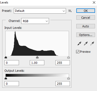
First off there is no perfect way to level an image as every image will be different and you'll need to eyeball them for your own uses. However there are some good general tricks you can use. If you notice the channel drop down box shows RGB. This basically is showing you all 3 channels together and lets you adjust them all together at once. This works fine for the most part but it's not a bad idea sometimes to manually go into each channel and adjust them, it really just depends on how much work you want to put into it. But to keep things simple lets just work with the RGB channel. If you notice along the bottom of the Input Levels section there are three sliders - a black, grey, and white one. The black and white ones are the ones you'll generally be adjusting. They tell Photoshop at what point we want colors in the image to be true black or true white and anything we pass them by with is made that way. What we're going to do is slide each just to the outside edges of where the black lines in the histogram appear so it should look like this.
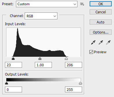
Now after doing that adjustment our image looks like this!

Much better! But there are some other useful tricks we can use while leveling.
If we hold down the ALT key while moving our sliders Photoshop will tell see what pixels it is making either true black or true white depending on the slider you're using. This is useful for when you know you have shades of black or white that should be true black or white but weren't picked up that way for various reasons and you need to visualize what you're doing while adjusting.
Another tip is to set the black and white points with the droppers.
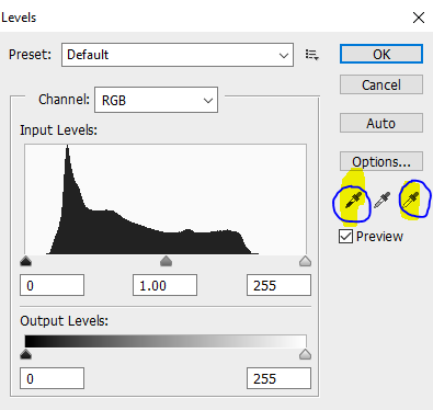
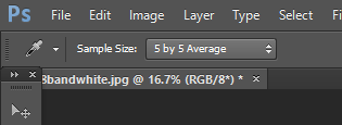
Black is on the left, grey is in the middle, and white is on the right. I generally just use black and white droppers, but the grey is useful for removing color casts if your image has one. Basically you click the eye dropper of your choice and click it on a part of your image you want to say is the blackest or whitest point of the image and it will adjust accordingly. One thing I recommend here though is making sure your sample size is 5×5 which you can set in Photoshop in the upper left corner.
While this can be a quick and easy way to level your image you have to be careful as it can easily cut off details you don't want to lose in darker or lighter areas. You'll honestly just need to experiment with your image and decide what method you think is best, or combine them! Sometimes I adjust my RGB channels just outside of the histogram like the above example and then set my black or white points with the droppers. It really just depends on what ends up looking best.
Last thing I want to touch on is the difference between the histograms on 48-bit vs 24-bit images which is where you can make an argument for using 48-bit, however I still argue that unless you are doing multiple major leveling edits you should be fine with 24-bit. A 48-bit histogram is much “wider” so when you make changes to it you don't lose information as easily, most of this information is rarely visible to the human eye however unless as I said you're doing multiple major edits. The methods we've gone over above that made the image looked much improved were not major edits in my opinion so 24-bit worked fine.